A History of Visual Design in the Alumnae Quarterly
As we close out the centennial year of the Mount Holyoke Alumnae Quarterly, we decided it was time to take a closer look at the physical magazine, in particular its design elements. Up until this point, our coverage of the Quarterly’s first one hundred years has focused almost entirely on the content in the magazine. With this feature, our goal was, as our writer Karyad Hallam ’12 said, “not to think of the Quarterly as a magazine, but as a work of art that happened to have pages and binding.”
Some of the images may be familiar, as we explore here—graphically—many of the same elements we examined in our winter 2017 issue. And, just as it was impossible to share a comprehensive history of letters to the editor (spring issue) or of class notes (summer issue), it is impossible to note every turn that the Quarterly designers took along its one-hundred-year journey. Curated here are highlights of inspired design, beginning with the very first issue in 1917 (the epitome of traditionalism) and leading up to the 1970s, when the modern Quarterly, and the modern magazine as we know it, begin to emerge. What these eras, and all the decades in between, have in common is that with every line and every jot, the design communicates feeling, spirit, personality, and purpose, preserving the historical essence of the time.
—Jennifer Grow ’94, editor
The 1910s and 1920s: “Accidentally Aesthetic”
Some of the most beautifully made publications come from the turn of the century, and a lot of them clash with the contemporary styles of today. Rather than ornate vestiges of Victorian sensibilities, nowadays the most functional approach is to have “clean” spreads with ample use of white space and layouts that blend illustration or photography together with text in a fluid fashion—creative but not cluttered.
Looking back one hundred years, there is something marvelously earthy about reading text from the Jazz age, something cozy in how the letters are close together (i.e., tightly kerned). The tell-tale speckles, ink bleeds, and irregularities characteristic of the presses of the time now have a charm that is hard to replicate with today’s refined printing methods and high expectations for accuracy of each printed page.
Many world events and technological developments that would go on to inform both content and design had yet to appear. Carol Brown Adams ’50, in a letter to the editor in the spring 1967 issue, looks back on this era as “pre-nuclear, pre-United Nations, pre-TV, pre-jet, pre-computer, pre-population explosion, pre-woman-suffrage.” In its earliest days the Quarterly—one of the oldest alumnae publications of its peer institutions—was not designed in a way that was responsive to current events or trends.
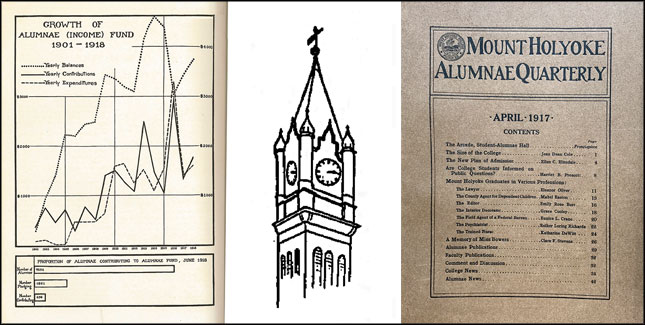
Even so, there is evidence early on of flourishes of creativity in the printing processes. In January 1919 the Quarterly ran a graph showing growth of the alumnae fund over the previous seventeen years. The page looks to have been printed as an insert and sewn into the issue, and the image itself is quite awe-inspiring. By looking closely at the lines of each letter, you can almost see how many drafts it went through, how hard the artist (not credited) tried to chisel away the inexactitude of the hand-drawn lines—without complete success, but still producing a lovely result.
In January 1926, the Quarterly included its first foldout page—a reproduction of a letter by Emily Dickinson, class of 1849—but we don’t see much experimentation yet. That would come in the next decade, when new design elements, including some color, were first introduced.
During this era focus on style was likely frowned upon and seen as frivolous by readers, especially in the continued wake of the Great War. (There is a similar postwar trend toward more conservative looks in the 1950s issues that followed World War II.) The editor and designer, then, needed to focus on content and readability above all else.
Since magazines in general were less experimental with space and color before the 1930s, the main outlet for creativity in print was in the form of black and white custom typefaces. Typographer Stanley Morison, perhaps best known for his design of the font Times New Roman, summed up concisely the thinking of the period: style should be “utilitarian” and only “accidentally aesthetic.”
During this era focus on style was likely frowned upon and seen as frivolous by readers, especially in the continued wake of the Great War.
From 1923 to 1930 a group of typographers called the Fleuron Society published a seven-volume journal containing essays on excellence in book arts called The Fleuron (a decorative flower-shaped ornament found on buildings, coins, books, and pastries). “Typographic advisor” is not a job title you come across often these days, but graphic designer certainly is, and these professionals made the case for why graphic design matters. In a 1930 talk called “Printing Should Be Invisible”—a speech that has been printed and reprinted on multiple occasions—typographer and Fleuron Society member Beatrice Warde warned that in experimenting with style, one must guard against being overly showy and distracting from the content of the writing. Hers was a more conservative approach to balancing the changing times. Today balance is sought out in the sense of unifying originality and nostalgia, evoking flavors from the past, as the history of Mount Holyoke is top of the mind to readers of the Quarterly.
Yet even when the historical spirit of the time demanded objectivity and focus on the needs of the audience, even when the designer attempted to create an unadorned look to the printed pages, beauty and individual style are noticed by those who spend time with back issues.
The 1930s: A Touch of Color
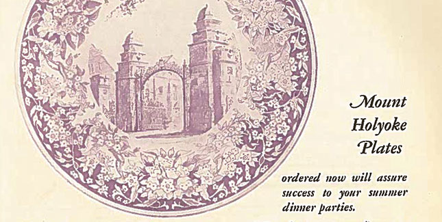
The style for the early 1930s begins to feel softer and more inviting, with larger fonts and italics that, by their nature, look like gently lapping waves. Overall the look is very whimsical—perhaps a reaction to the troubled times—and one might find any given page reminiscent of a theatrical quarto or a classical concert program. Color appears for the first time in May 1931—in an advertisement for decorative plates—the page now aged to a wispy watercolor purple.
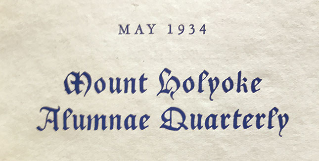
Some interesting things happen when an art form previously reserved for the human hand—calligraphy—is transitioned to the workings of a machine that punches and heat-treats and stamps its way to completion. There is a certain efficiency to the process, and yet the personal touch begins to be lost. In May 1934 the streamlined, utilitarian font of the title on the cover gets a stylish and calligraphic redesign into something the editor, Florence Clement, class of 1914, describes as “French Gothic.” “The very unique feature in this issue is the typography—which surely you have noted and found pleasing to the eye and fancy,” she writes, to this day seemingly breaking a fourth dimension and speaking directly to us from eighty-three years in the past.
Redesigns in general were a chance to showcase individual talent and alumnae designers…
This sense of time travel happens frequently while reading through previous issues. Conversations unfold in the Comments and Discussion (letters to the editor) section—renamed Speaking Up in 1960—that illustrate readers’ strong reactions to style and design. Redesigns in general were a chance to showcase individual talent and alumnae designers, but another possible reason for redesign at this time may be inferred from an advertisement for TIME magazine in the May 1932 issue: “Cultivated Americans, impatient with cheap sensationalism and windy bias, turn increasingly to publications edited in the historical spirit.” Designers were beginning to think about a publication’s need to appear more self-aware and became more and more keen to present their work in the right fashion.
Into the 1940s: Many Redesigns, Fewer Resources
Before television became a household norm in the 1950s and 1960s, books, magazines, radio, and comics were the chief sources of entertainment and information. But as technology expanded, offering more options, designers began to take more chances—more unconventional turns—perhaps aiming to catch the eyes of readers who had more demands on their attention.
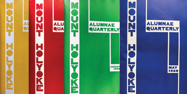
The May 1939 cover of the Quarterly is a perfect example, with the title of the magazine running down the side of the page vertically instead of centered and up top as per usual. The layout change is simple and yet a marked departure from the previous twenty-two years. The new cover look was designed by a member of the Mount Holyoke art department, Anna MacCarthy, class of 1926. The text is blocky and architectural: the O in Mount and Holyoke and A, Q, and R in Quarterly are filled in like cement frames, and gone are the naturalistic floral headers and curving fonts from earlier in the decade. With the bright monochrome, this cover would not have looked out of place among those of the coming decade of the 1970s, when all four class colors were again used in prominence on the cover.
And, just a year later, the May 1940 Quarterly is redesigned yet again, this time by Elaine Rushmore ’36 and her father A.W. Rushmore. The redesign is proudly explained on the inside front cover, emphasizing the importance of not just reading the magazine to get news but taking it in as a work of art. Again, the pattern seems to be celebrating individual creativity and offering readers opportunities to be patrons to the arts. These years of designs with no predictability or continuity were a big change from the very first issues of the Quarterly, which were buttoned-up and strictly business.
The layout change is simple and yet a marked departure from the previous twenty-two years.
Unfortunately, as the war years defined resources and priorities, the climate for individual creativity ran dry after 1940 and wouldn’t be seen again for decades. The paper stock of the cover in May 1944 becomes neither matte nor gloss but more like construction paper—just like the first issue. Florence Clement, class of 1914, the Quarterly’s longest serving editor, explains in August 1945: “Paper Shortage. No doubt you have heard there is one. And that is the reason, and the only one, why this summer Quarterly contains 32 pages instead of the usual 48 or more. . . . Nevertheless, we truly welcome all new subscribers and in time we hope to make up to new and old for this drastic cutting.”
The 1960s and 1970s: Future Shock and the Modern Magazine
After the relatively sleepy style era of the 1950s (the luxury of design flourishes mostly going toward advertisements rather than editorial), there is no other way to describe the Quarterly of the early 1960s than as groovy. One might even go so far as to say that by the late 1960s and early 1970s the magazine reached a peak of unrelenting weirdness.
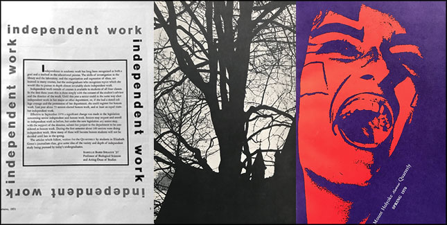
In the winter 1972 issue, end marks (design elements still used today to signal the end of an article, usually a square) are used very prominently, in fact a little too often, as they are both at the end and at the beginning of articles. Several covers and a few interior pages feature text running sideways or wrapped 360 degrees around a paragraph. Capitalization is dropped entirely from headers. To say that graphic designers got carried away with the new technologies available would be putting it mildly, but who’s complaining? Certainly not collectors, or alumnae readers who want always to know more about their hallmark publication.
One thing that has not changed in one hundred years are the alumnae voices in each issue that speak right from the page, often in response to previous issues, in both content and design. A photographic design technique that debuted in the winter 1971 issue—ghosting, a neat trick whereby an image (in this case, one of trees and Mary Lyon Hall) is faded to maybe 10 percent of its original darkness so it can be used as a background behind the text—resulted in a number of alumnae responses. Though they noticed—and admired—the technique, readers struggled with readability. Betty Widtman Berg, class of 1920, expressed her opinions in a letter printed in the spring 1971 issue: “I am really distressed with the last Quarterly—the cover—the back cover—the layout—the format—reading through trees. . . . I was glad to get to the class notes, where there was still some order.” The class notes at that point had not changed in style or layout for more than forty years, a testament to how design can instantly affect readers in ways that are deeply emotional, from quite comfortable to most distressing.
To say that graphic designers got carried away with the new technologies available would be putting it mildly, but who’s complaining?
The cover of the spring 1970 issue is worth a mention, too, a raucous explosion of magentas and oranges careening across the page. Putting this side-by-side with the debut issue of fifty-three years earlier is a dizzying experience. An artistically distorted image of a woman fills the whole page, and she appears to be screaming, exuberantly, we hope. The publication title is tucked on the bottom of the page on a diagonal, instead of prominently centered and at the top as per tradition. This is an unusual style choice that subverts the principles of visual hierarchy. Perhaps by way of topsy-turvy, upside-down placement, the designers of the Quarterly were trying to acknowledge the cultural climate of the time: campus-wide protests, future shock, moon landings, free love, and rock ‘n’ roll.
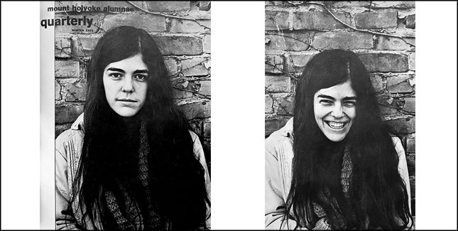
The winter 1971 Quarterly presents a design introduced for the first time and never used again. The cover features two photographs—one each on the front and back cover—of the same person, leading the reader to imagine what happened between the taking of the photographs. The inside front and back covers also call on the reader to envision a sort of missing piece of the image—a campus skyscape. The technique is reminiscent of cinema’s Kuleshov effect. First used in the early twentieth century by cinematographer Lev Kuleshov, the technique introduces multiple images of the same scene to tell a story and is based on the belief that we can derive more meaning from viewing these multiple images.
The concept is simple, and clever. And as a technique it successfully demonstrates the potential—and power—of the magazine format as an art form and the Quarterly as a lasting publication. One can only wonder—and look forward to—the changes that are to be seen in the next century.
—By Karyad Hallam ’12
Karyad Hallam ’12 is a writer, percussionist, and pen-and-ink mixed media artist, exploring the intersection of book arts, graphic design, and the written word as a hybrid of language and art form.
This article appeared as “Style with Substance: A History of Visual Design in the Quarterly” in the fall 2017 issue of the Alumnae Quarterly.
October 13, 2017






Leave a Reply