A Closer Look: The Iconic Iconographer
New Book Showcases Best-Known Work of Susan Kare ’75
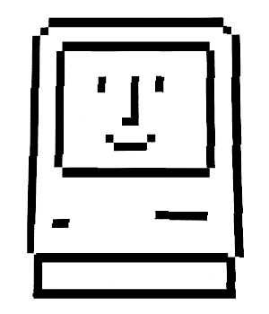
Susan Kare ’75 has created countless computer icons during her three-decade career as a graphic designer for a who’s who of Silicon Valley tech corporations. Many of her icons, including Apple’s Happy Macintosh, the Windows 3.0 solitaire deck, and Facebook’s Kiss Mark, are instantly recognizable.
In 2004 HOW magazine asked Kare to comment on the influence her early work for the Macintosh’s original operating system has had on the personal-computer industry.
“It’s not something I think about,” she replied. “It’s not my place to assess.”
She appears to have changed her mind since then.
In 2010 she launched a website, kareprints.com, selling limited-edition prints of her selected icons on colorful backgrounds, and last year she published Susan Kare ICONS (Watermark Press), featuring her favorite images created between 1983 and 2011.
This iconographer, it seems, has achieved iconic status.
Susan Kare ICONS kicks off with an introductory essay by Wired magazine contributing editor Steve Silberman, who calls it a “charmingly modest and long overdue book.”
Silberman’s essay, “Signposts in New Space,” situates Kare’s career within the relatively recent history of home computing, from 1983, when she became “one of the [Macintosh] team’s most auspicious early hires,” to 2007, when she began creating virtual gifts for Facebook.
“For years,” Silberman writes, “thousands of Facebook users a day swapped Karedesigned birthday cakes, disco balls, roses, and engagement rings as virtual gifts, never knowing they were designed by the same
artist whose smiling image of the ‘Happy Mac’ greeted a generation at the threshold of a new world.”
Susan Kare ICONS is an art book, but not a Taschen-type behemoth that sits like so many bricks on your coffee table. This softcover book is diminutive—just seven inches by seven inches. Each copy is signed by Kare.
The eighty icons in the book are shown two ways: actual size—as they would appear on a screen—and magnified. The “zoomed-in view,” Kare says, “allows the reader to see how many icons are crafted pixel by pixel”—or, at least, how many were crafted pixel by pixel, before graphic-design software like Adobe Illustrator came along.
The book favors pictures over words, which is to be expected, but Kare’s commentary accompanies selected
images, adding a welcome, if too infrequent, measure of insight and humor.
For example, Kare writes that Bomb, one of her icons for the original Macintosh, “was designed to resemble a cartoon explosive and represent a system failure—the programmers explained that no one would ever be likely to see it. Unfortunately, that wasn’t the case. Once, a phone call was transferred to the Mac software group because a user had seen the icon on her screen and was extremely concerned that her computer might explode!”
Fast-forward to Kare’s Facebook days (2007–2010), when she created Penguin, among many other virtual
gifts. She writes, “This image represents two lessons learned creating five penguin Facebook gifts: 1) Cute often trumps edgy or minimal. 2) People really, really like penguins.”
—By Christina Barber-Just
This article appeared in the fall 2012 issue of the Alumnae Quarterly.
December 7, 2012


Leave a Reply